Quilt Info:
Pattern: Ursula from GE Designs
Size: 40" x 50"
Batting: Quilters Dream 80/20 Cotton White
Thread: Glide--Tar Heel
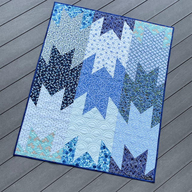
To make this quilt, I pulled together 12 various fat quarters from my collection.
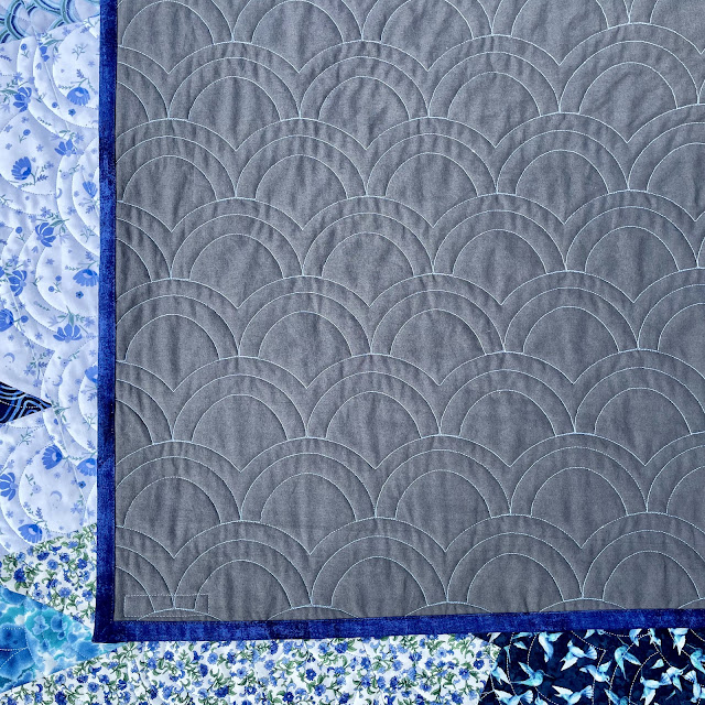
More of the 60" wide IKEA solid grey for backing.⤵️ I love how the quilting shows up on it!I admit, I could've dispersed the colors better. The darks ended up in a row together and the lights ended up in a row together. The blocks are made so that one block has half of the FQ and the block next to it has the second half of the FQ. That means there's no switching blocks around on the design wall--they've got to stay in line together, or one has to do a lot of ripping, which I didn't want to do. Live and learn!
I wonder if this was the designers take on making a simplified Delectable Mountains quilt. Just a thought. People have said they look like frogs, or bats. I would prefer they looked like mountains!
Below are my first 7 quilts in the yearlong Stripology Quickies Club. The second and third photos are both "Skyler" quilts in different layouts, which is why there are 8 photos!
I'm working on "Frankie" now, using Tula Pink fabrics! The "Holly" cutting video has been released, with the teaching video coming out July 30th. ⤵️
Grace and peace!!! ~Nancy
You'll find more quilt inspiration at July Favorite Finish, Wednesday Wait Loss, Needle & Thread Thursday, Put Your Foot Down, TGIFF, Off the Wall Friday, Finished Or Not Friday, From Bolt To Beauty, Patchwork & Quilts, Oh Scrap, Handmade Monday, Sew & Tell, Design Wall Monday, Monday Musings.


What an interesting quilt. I like the colour layout as it is. Yes, I can see mountains.
ReplyDeleteBut the frogs really jumped out at me, too.
Lovely blues.
Nice! I look forward to using my new Stripology ruler, haven't even tried it yet. I love the blues, and I love your color distribution!
ReplyDeleteYour quilt definitely has the look of mountains! I couldn't see a frog until you mentioned it. Great colors!
ReplyDeleteI definitely thought Delectable Mountains when I saw it! That was a genius idea of using that quilting design:)
ReplyDeleteThe first thing I noticed was the fabric in the top right and the quilting! I'm thinking mountains as well. I think the color placement looks great.
ReplyDeleteI see what you mean about the placement of the blocks. I suppose with more planning, you can get the distribution you're looking for but what's the fun in that? Your quilt looks lovely just the same. My first thought was mountains as well, so mountains it is! Thanks for sharing on my weekly show and tell, Wednesday Wait Loss.
ReplyDeletehttps://www.inquiringquilter.com/questions/2025/07/23/wednesday-wait-loss-442
This is a great quilting design for this quilt! :)
ReplyDeleteThat's a pretty one in all the blues, Nancy! I admit I did see bats in those block shapes. But I think bats are fascinating, so it's all good! If made in Halloween colors, this could be even more fun!
ReplyDeleteOooh I love this, Nancy. I immediately saw the mountains.I have always wanted to make a Delectable Mountain quilt. This one looks like a fun one to work on. Love that blueberry fabric too. Hugs
ReplyDeleteSorry, I see bats. LOL! But I like the striping effect of the lights and darks in rows. Great Job on matching the quilting design.
ReplyDeleteBeautiful blog
ReplyDeleteOh, what a pretty quilt! The quilting pattern reminds me of the top fabric, but Japanese fabrics too, and sashiko stitches. Maybe this is because your quilt is blue? ;)
ReplyDeleteThank you for sharing your pretty quilts and linking up!
Love this quilt and the quilting. I do see mountains and can see that the distribution could be a bit different but sometimes the quilt or fabric has its own ideas of what it wants to be! Love that pantograph, too.
ReplyDeleteNow I see bats too! I do like the quilt tho. Love the pattern!
ReplyDeletei see the mountains - that is what i saw first... but now I can see the others too haha!! i like the color placement - gives it a second strippy look
ReplyDeleteWell this one looks great too! Such a nice, simply design, as is the quilting motif, which I love. The quilt looks perfectly put together. I'm happy for you to be on this "quickie" kick. That's a word that's never been in my quiltmaking vocabulary!
ReplyDeleteImpressive amount of quilts you have finished this year in the Stripology series. Each one is so interesting to the eye! --TerryK@OnGoingProjects
ReplyDeleteBeautiful blue mountains! And I love the clam shell quilting!
ReplyDeleteMy first thought was Delectable Mountains. I like the color placements as it contrasts nicely with the row below. Great choice on the quilting pattern.
ReplyDeleteI really like the layout, with the darks and lights aligning like that. Very pretty!!
ReplyDeleteAnother one of the "bat team" over here ;) And wanting to add that I like the stripey layout wiht the dark/light contrast. xo
ReplyDeleteI can see the relationship to Detectable Mountains and think that they could look like mountains with atmospheric perspective in your colors! Congratulations on another beautiful finish and thanks for linking up with Favorite Finish. :)
ReplyDeleteHonestly I just love the fact that you are still living and learning with your quilting! It's easy to think that everyone else is doing perfect work all the time and never having second thoughts over what they've made. Personally I think the stripe effect looks great here but it is nice to hear that even someone with your mad quilting skills can wish to do things differently another time :-)
ReplyDeleteBeautiful quilt, Nancy! Love the blues. I saw delectable mountains at first then when you mentioned frogs, I see bats and horned toads! LOL At any rate, I love it! Thanks for sharing with us at Monday Musings.
ReplyDelete